Stripes, florals, botanicals, and traditional rugs—oh my! Mixing different patterns in one room can feel like an interior design minefield, but when done right, it creates an effortlessly curated, maximalist haven. When you walk into a space with a bold berry accent wall, it immediately commands you attention. It is moody, romantic and beautifully intense. But what happens when you turn around? How do you decorate the rest of the bedroom so it doesn’t feel like two completely different house stitched together?
The secret isn’t matching everything perfectly. Instead, it is all about pulling subtle color threads and graphic elements from your high-energy zone and scattering them gently into your quiet zones.
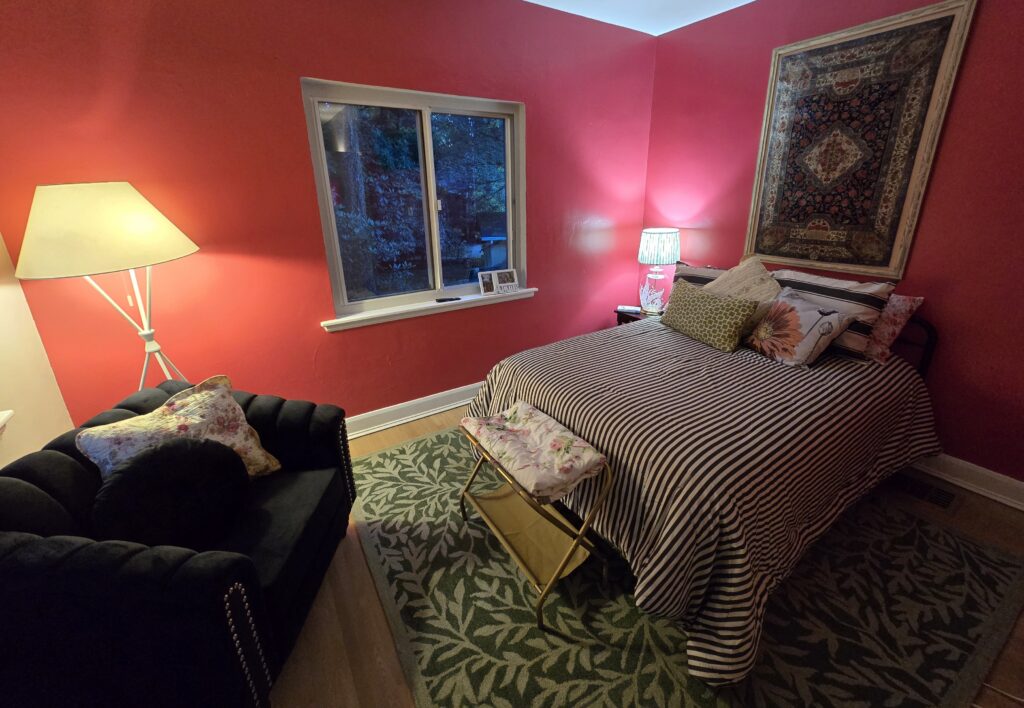
The Green Thread: Living Botanicals
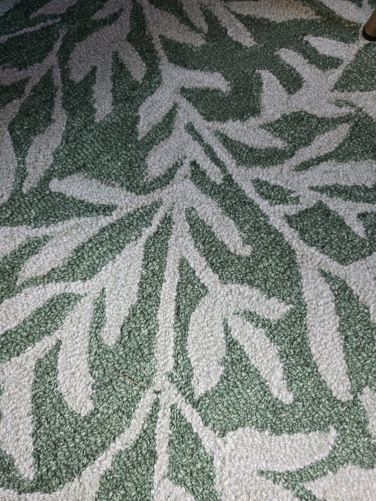
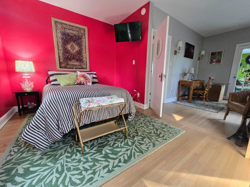
The High-Drama Side: Under the bed, a large, deep green rug with an oversized leaf motif grounds the fiery energy of the rose walls.
The Soft Nook Side:
Across the room, that bold green transforms into actual life. A beautifully braided weeping tree and a vibrant green glass vase echo that same botanical energy, giving the eyes a natural, organic place to rest.
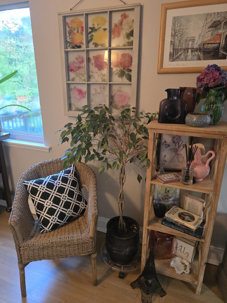
The Red-to Pink Softening
The High-Drama Side – The walls are an unapologetically, saturated berry red that creates an intimate, enclosed sanctuary around the bed.
The Soft Nook Side – To keep the reading corner bright and airy, the walls shift to a soft neutral gray. However, the berry red doesn’t disappear. It is dialed back into the dusty pink glassware on the shelf, soft watercolor roses framed in an antique window pane and the fresh hydrangeas on the shelf. The color is still there—it is just whispering insteading of shouting.
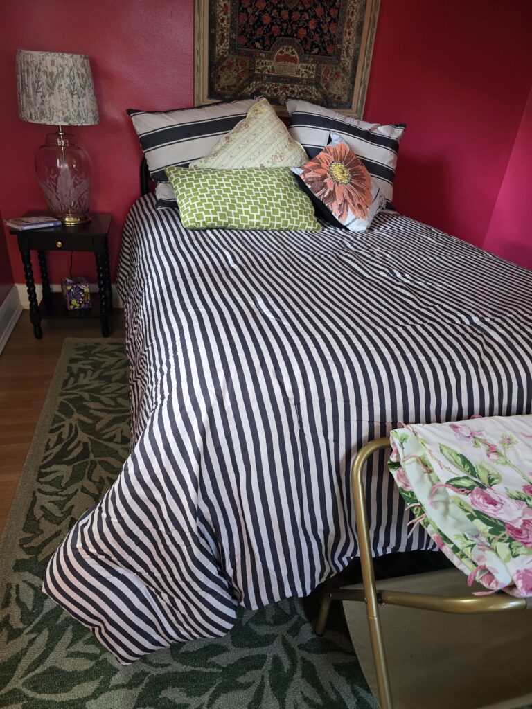
Balancing the Graphics
The High-Drama side – The bed features a bold, wide deep gray and white striped cover that says classic Paris chic.
The Soft Nook Side – To tie into the graphic look without cluttering the wicker chair, a geometric black-and-white lattice pillow is tossed into the seat. Because the scale of the pattern shifts from white stripes to smaller lines, the two items look related, more like cousins, instead of twins.
The Velvet Pivot: Grounding the Drama with Deep Black
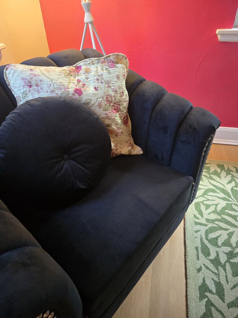
Just when you think the room is a game of pure contract between “crimson and cream,” a deep black velvet arm chair is added for a lazy afternoon of reading. It serves as an anchor that stops the high-energy wall paint from feeling floaty or overwhelming and changes the simple corner into a luxurious, tactile reading destination.
The Floral Bridge – Tossing a soft, vintage quilted floral pillow onto the chair pulls the delicate pink and yellows from across the room.
The Vision is Set (But the Story isn’t Over)
Designing a room that reflects your personality (or a side of your personality) is a journey, not a weekend race. While this space isn’t finished–I am still on the hunt for the perfect window treatments and just the right pieces of wall art to complete the vignettes and pulling in that desk area where I imagine journaling–the soul of the room is locked in.
What started as a wild vision of bold, high-drama color, classic French stripes, and a soft romantic infusion has evolved into a comforting, layered sanctuary. It proves that you don’t have to put your style into a single box. You can have the moody maximalist bedroom drama and the quiet, sunlit cottage-core reading nook all within the same walls.
Leave me your comments! Which corner, so far in the room speaks to you more, the high drama or the soft vintage? What kind of window treatments would you think would tie these two distinct vibes together?